|
|
Post by SkeletonMan on Sept 2, 2011 13:43:04 GMT -5
anonimus's blue banner is awesome, i love the red, but the blue is easier on the eyes
|
|
|
|
Post by shrieker_fan on Sept 2, 2011 14:50:35 GMT -5
I voted for Anonimusdinonicus's blue version. The red banner feels more JP, but damn I love blue, lol. Trike123: I loved the goat, man!  I liked everyones, really. There were a lot of great ideas! |
|
anonimusdinonicus
Junior Member
 Banner Contest Winner
God creates dinosaur. God destroys dinosaur. God creates man. Man destroys God. And everything else.
Banner Contest Winner
God creates dinosaur. God destroys dinosaur. God creates man. Man destroys God. And everything else.
Posts: 440
|
Post by anonimusdinonicus on Sept 2, 2011 18:19:57 GMT -5
Well anonimus, while I appreciate your enthusiasm, the rules are clear: new submissions will not be added anymore. Deadlines are deadlines for a reason. Besides, I cannot edit the poll even if I wanted to. Besides, it will create awkward situations if people want to vote for a new banner that isn't in the original batch. I just have to be very strict here. @ Sima, they aren't troll. As with all things, some people are more talented than others. These people took the time to make these banners, and that's enough for them to get my appreciation. Got it. |
|
|
|
Post by BeYonD NuTz on Sept 2, 2011 19:26:41 GMT -5
Instead of voting for either blue or red.. You could use both? Red for Main and Blue for any JPS2 related info.
Just a thought
|
|
|
|
Post by stlrams53 on Sept 2, 2011 21:57:44 GMT -5
That a good idea use Red for the main page and blue for somthing else.
|
|
sima
Junior Member
Posts: 132
|
Post by sima on Sept 3, 2011 2:01:47 GMT -5
Can't you use red for the main page, and blue for the forum...look at what colour the forum is......bingo  |
|
|
|
Post by Carcharodontosaurus on Sept 3, 2011 4:31:29 GMT -5
Good ideas everyone, but I think Sima's idea is the best here (for example I can't use different banners for different pages, they all run on one script which accepts only one banner). But I want to wait until the voting ends in 2 months before making a decision. If another banner than the anonimus' red one wins it's pointless to decide anything now.
|
|
anonimusdinonicus
Junior Member
Banner Contest Winner
God creates dinosaur. God destroys dinosaur. God creates man. Man destroys God. And everything else.
Posts: 440
|
Post by anonimusdinonicus on Sept 3, 2011 5:41:16 GMT -5
Carchar's right. This is a two month-long poll. I'm not counting my hatchlings before they hatch and I'd appreciate it if everyone else stay out of my incubator altogether. However, as far as a forum banner, I already have one finished. I just haven't uploaded it because I figured I would wait to see if I win. I'm not going to use the same banner for both...that would be lazy. The Forum banner now is in a GIF format, so if my banner wins and I am granted the opportunity to submit a forum banner, it will be either an animated GIF or APNG image. I haven't decided how many frames it will consist of, but there will only be two or three different images within it. The photoshopping's done, it's just a matter of making it look good when it plays.
|
|
|
|
Post by ChrisLikesDinos on Sept 3, 2011 12:17:24 GMT -5
This one all the way IMO-  |
|
|
|
Post by Carcharodontosaurus on Sept 4, 2011 10:45:26 GMT -5
Carchar's right. This is a two month-long poll. I'm not counting my hatchlings before they hatch and I'd appreciate it if everyone else stay out of my incubator altogether. However, as far as a forum banner, I already have one finished. I just haven't uploaded it because I figured I would wait to see if I win. I'm not going to use the same banner for both...that would be lazy. The Forum banner now is in a GIF format, so if my banner wins and I am granted the opportunity to submit a forum banner, it will be either an animated GIF or APNG image. I haven't decided how many frames it will consist of, but there will only be two or three different images within it. The photoshopping's done, it's just a matter of making it look good when it plays. Well, that's even better  . We'll see, just 56 days to go. |
|
|
|
Post by rexmaster4ever on Sept 4, 2011 19:38:53 GMT -5
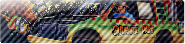
Red Main Site Banner:  Haha, this is easily the best and it would look amazing for this website, I love it!!! "Ten years of sparing no expense!"... I love it!!!!! |
|
|
|
Post by raptorx85 on Sept 5, 2011 14:06:14 GMT -5
There are several that i actually like, however they all contain some features that just dont fit or feel right (in my opinion).
Thats why i my vote went to the red JP banner (points above). This one is the only one free of elements that dont feel right (this also goes for the blue version).
|
|
|
|
Post by trexjp32 on Sept 6, 2011 23:56:37 GMT -5
I voted Anonimusdinonicus' red one. By far the best. But everyone did great! I appreciate the votes and compliments, though. Even if mine really was half-cooked. |
|
metria_c85
New Member
Une aventure qui a débuté il y a 65 millions d'années.
Posts: 91
|
Post by metria_c85 on Sept 7, 2011 0:19:38 GMT -5
Thanks to the voters of my banners! Though I mentioned that I was going to vote for Anonimusdinonicus, I couldn't help but vote for my Pteranodon banner considering that he will, beyond all reasonable doubt, win with a comfy margin :-)
Congrats to all participants and especially their valuable input into helping improvements!
|
|
anonimusdinonicus
Junior Member
Banner Contest Winner
God creates dinosaur. God destroys dinosaur. God creates man. Man destroys God. And everything else.
Posts: 440
|
Post by anonimusdinonicus on Sept 7, 2011 3:59:14 GMT -5
Hey, Metria...I voted for you and I hope you get more votes. I like your design a lot. It's a lot easier on the eyes than mine and it really does look like something from the cover of a JP toys catalog. If I had my way around here, I'd make it so both of our banners were used in different sections. Not to mention, mine isn't exactly site-friendly after all. Yours has an actual end to it, while mine continues into neverland resolutions. The problem with mine is that it can't be made seamless as far as I know. Yours is easier to work with because of the curve on the bottom right side.
I'm hoping that makes it clear for everyone. Mine isn't perfect for the site. It may be the most colorful, but when it comes down to making it look right on EVERY monitor out there, it may take some work. Metria pointed this out from the getgo and I couldn't figure out what he was talking about at first, but he wast right. On a 1280 x whatever resolution, you're going to see a "continuation" of the banner to the right of your screen. This wasn't made clear in the banner contest rules, but it may have been more obvious to some than to others. I for one never picked up on it, and because that "continuation" is simply another image that the actual banner overlaps, it could be difficult to integrate mine into it. Like I said, I won't be able to fix that without the help of Carchar or another site admin. Metria's is perfect because all you have to do to make his work seamlessly is white out the underlying "background" image that continues to the right of any monitor above 1280 pixels in width. Sucks for me, really.
|
|


 . We'll see, just 56 days to go.