|
|
Post by Jpraptor on Nov 3, 2011 18:31:18 GMT -5
lmao...I had no idea today was the last day. Thank you for your votes, guys! It's an honor. If I make a bigger banner, will it stretch to the right automatically and fix the problem? If so, how long a banner should I make? Edit: Holy crap 6 stars!? WOOOOOT Congrats! You deserved it  |
|
anonimusdinonicus
Junior Member
 Banner Contest Winner
God creates dinosaur. God destroys dinosaur. God creates man. Man destroys God. And everything else.
Banner Contest Winner
God creates dinosaur. God destroys dinosaur. God creates man. Man destroys God. And everything else.
Posts: 440
|
Post by anonimusdinonicus on Nov 3, 2011 18:46:47 GMT -5
Thanks raptor!
Carchar,
Are you sure a longer banner wouldn't simply continue to overlap the underlying banner? On my screen in 1280x1024, the banner displays perfectly. It's literally a perfect fit, only leaving space for the scroll bar on the right side of any browser I use. On larger resolutions, however, it gets cut off and you can see the underlying banner.
I don't think there is a way to seamlessly integrate mine into the background like you did with the old banner. So what I'm thinking is creating a longer banner should look EXACTLY as it does now on a 1280x1024 resolution, but should extend respectively to higher resolutions. Basically what I'd be aiming to do is extend the banner horizontally to 1920 pixels, which isn't a far stretch from the current 1264.
For example, if you look at the site in 1024 by 768 res, you can't see the entire banner. In fact, anything lower than 1152x864 and the site just doesn't look right...scrolling gets all messed up. In 1152x864, everything seems to work fine on first glance, but the banner gets cut off.
So, as long as everyone with a resolution higher than 1280 pixels in width can see the underlying banner, making a longer foreground banner will work seamlessly.
Edit:
Also, I will get the Forum banner to you by Monday!
|
|
|
|
Post by Carcharodontosaurus on Nov 4, 2011 4:47:03 GMT -5
It turns out the scrolling problem was because of a picture used in one of the main page updates, not because of the new banner.
Anonimus, feel free to make a larger banner, as long as you keep the logo on this very spot. Move it more to right (to keep it the middle) might cause it to disappear if people use smaller screens. I'd be happy to upload your larger banner to the site. Looking forward to upload your forum banner too!
Oh, and if you can, could you continue the yellow and black tape on the bottom of the banner all the way to the left? It fits the black menu on the left in my screen, but it seems not all browsers load it correctly. If you fill that black part up with tape, it solves that minor issue.
|
|
|
|
Post by Roselaar on Nov 4, 2011 15:51:33 GMT -5
Anonimus has six stars...? 'Ouch' for us mods...  |
|
|
|
Post by 0thebigwytec5 on Nov 4, 2011 17:10:02 GMT -5
Anonimus has six stars...? 'Ouch' for us mods...  |
|
|
|
Post by Carcharodontosaurus on Nov 4, 2011 17:42:26 GMT -5
Woops, my bad. I made a typo in his new ranking. My sincere apologies to everyone.
|
|
RipJaw ///
Junior Member
Life breaks free.
Posts: 229 
|
Post by RipJaw /// on Nov 5, 2011 1:00:06 GMT -5
Anonimusdinonicus you banner is really great and Carcharodontosaurus the website looks amazing it suits the site
|
|
|
|
Post by Jptoycollector on Nov 5, 2011 20:08:05 GMT -5
The banner looks great. Very nice work. It has been a while since I have fooled this stuff but wouldn't adding a simple percentage tag to the image fix the size problem? Sorry if I'm way off but I was reading and I figured I'd offer a suggestion.
Anyway, most people now have resolutions way higher than 1024x768. Monitors are ridiculously huge nowadays. Looks great though.
|
|
|
|
Post by Carcharodontosaurus on Nov 6, 2011 5:28:39 GMT -5
The banner looks great. Very nice work. It has been a while since I have fooled this stuff but wouldn't adding a simple percentage tag to the image fix the size problem? Sorry if I'm way off but I was reading and I figured I'd offer a suggestion. Anyway, most people now have resolutions way higher than 1024x768. Monitors are ridiculously huge nowadays. Looks great though. As a matter of fact, I've been thinking about that. It might work, but it will make the banner blurry I'm afraid. But I'll keep it in mind though. I'll wait and see what anonimus can come up with. |
|
|
|
Post by Jptoycollector on Nov 6, 2011 19:40:00 GMT -5
The banner looks great. Very nice work. It has been a while since I have fooled this stuff but wouldn't adding a simple percentage tag to the image fix the size problem? Sorry if I'm way off but I was reading and I figured I'd offer a suggestion. Anyway, most people now have resolutions way higher than 1024x768. Monitors are ridiculously huge nowadays. Looks great though. As a matter of fact, I've been thinking about that. It might work, but it will make the banner blurry I'm afraid. But I'll keep it in mind though. I'll wait and see what anonimus can come up with. You are right, it would become distorted and stretched at different resolutions..well it was worth a try at least. |
|
anonimusdinonicus
Junior Member
Banner Contest Winner
God creates dinosaur. God destroys dinosaur. God creates man. Man destroys God. And everything else.
Posts: 440
|
Post by anonimusdinonicus on Nov 7, 2011 10:59:27 GMT -5
I'm just making an all new banner. Stretching this one would make it look like craaaaaaaaap.
|
|
anonimusdinonicus
Junior Member
Banner Contest Winner
God creates dinosaur. God destroys dinosaur. God creates man. Man destroys God. And everything else.
Posts: 440
|
Post by anonimusdinonicus on Nov 8, 2011 21:24:02 GMT -5
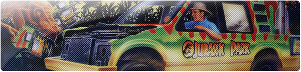
Abusing win to double post...just finished the "1080p" version of the banner. I sent a message to Carchar about how to make a random image generator with HTML so we can use the red AND blue banners so that everyone's happy. Now that I made the extention to the banner, that much red can be really uneasy on the eyes...even worse than it was before.   Edit: I didn't fix the construction tape problem to the left of the banner that some of you might be seeing. Carchar said some people had a problem with its alignment to the menu on the site. I'm curious to know which browsers you are using and what resolution your video cards are set to. It's a lot for me to overlap that part with construction tape simply because I feel it kills the banner's seamless integration. Let me know what you're seeing and I can probably figure out a way to fix it for you. Edit: And I just finished the forum banner. I made two versions, although they may look the same to some. One is a 256-color version and the other is a 32. The difference is about half a meg in size, which will effect loading times. I'd like to use the high quality one, but the 32-color version doesn't look bad and it loads fast, so I'll leave it up to you guys. That is if anybody wants to use this banner at all. I've pretty much eaten up all of the possible cutouts from JP toys boxes and cards, so I hope you like it because I am completely out of ideas...until the next banner contest ;-) Here they are: 256:  32:  |
|
|
|
Post by Roselaar on Nov 9, 2011 8:15:41 GMT -5
Wow, those look pretty good as well! I like the rain effect. Would be cool to see these up too.
|
|
anonimusdinonicus
Junior Member
Banner Contest Winner
God creates dinosaur. God destroys dinosaur. God creates man. Man destroys God. And everything else.
Posts: 440
|
Post by anonimusdinonicus on Nov 10, 2011 2:39:46 GMT -5
Thanks, Roselaar :-)
I know the rain effect looks really busy, but I tried lighter rain and it just doesn't work. When it rains it pours in JP and I was hoping to make it look like a real storm. I also tried adding more rain frames to the gif to avoid repetitiveness, but of course the more frames you use the bigger the image is...and a meg is a lot for the forum banner.
For the record to you all, start critiquing, please...seriously. If there are any objections to the things I submit I am up for fixing them until they meet every viewer's standards. As long as it doesn't involve flash. I have 0 experience with Flash and I don't plan on learning it in a day.
|
|
|
|
Post by 0thebigwytec5 on Nov 10, 2011 2:52:45 GMT -5
Nice work man!
The storm effect is very cool. Nice idea!
|
|